Tree view
Tree view is a hierarchical list of items that may have a parent-child relationship where children can be toggled into view by expanding or collapsing their parent item.
Anatomy
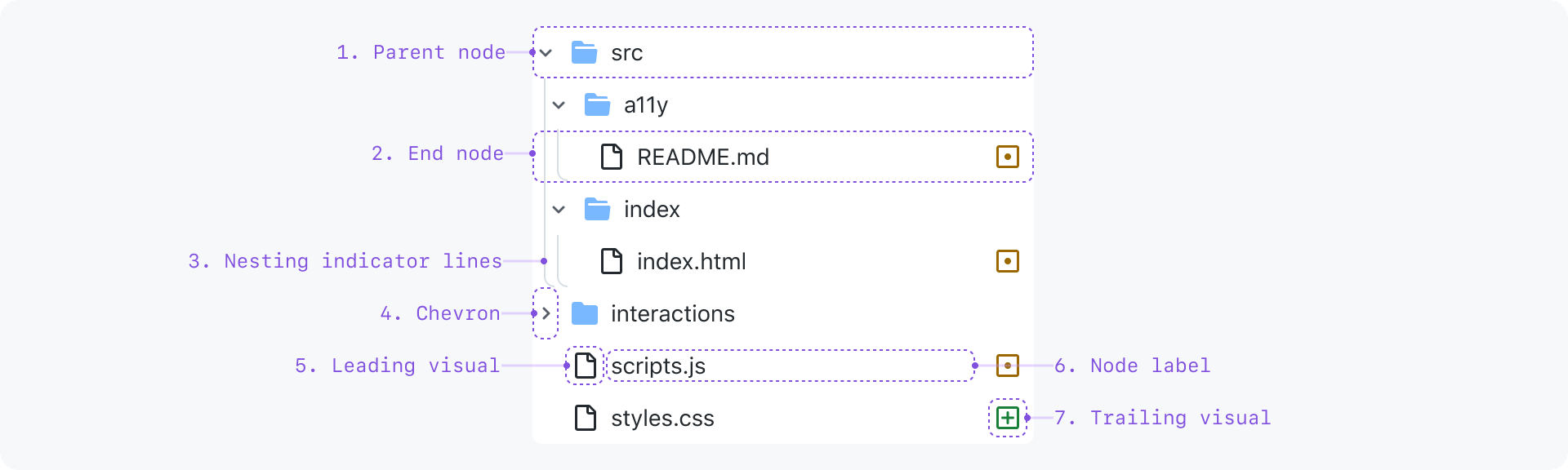
- Parent node: A node that hides and shows child nodes by expanding and collapsing
- End node: A node with no children
- Nesting level indicator lines: Each line represents a level of nesting depth
- Chevron: Toggles a parent node expanded or collapsed and indicates expanded/collapsed state
- Leading visual (optional): A visual cue for additional context
- Node label: The text label for the node
- Trailing visual (optional): Same as a leading visual, but at the end
Interactive Example
File Explorer
Content
Node label
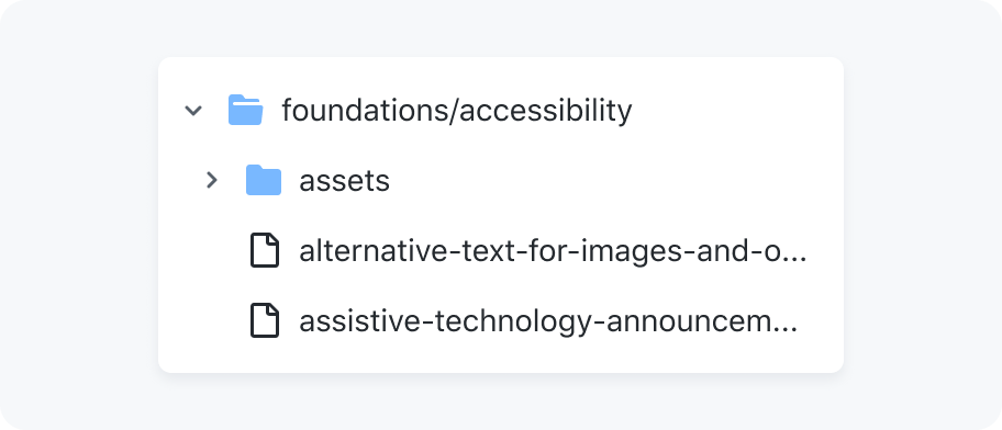
Node labels should be a succinct title for whatever entity the node represents. For example, a file name. By default, labels are truncated to a single line. However, node labels may be wrapped to multiple lines in cases where the entire label must always be visible.
Single line truncation

Wrapping node label text
Leading and trailing visuals
Leading and trailing visuals may be used as visual cues that communicate more information about a node. Either all nodes have leading visuals, or no nodes have leading visuals. Leading visuals must be accompanied by a text label.
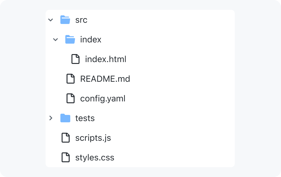
Render all nodes with leading visuals and text labels or just with text labels
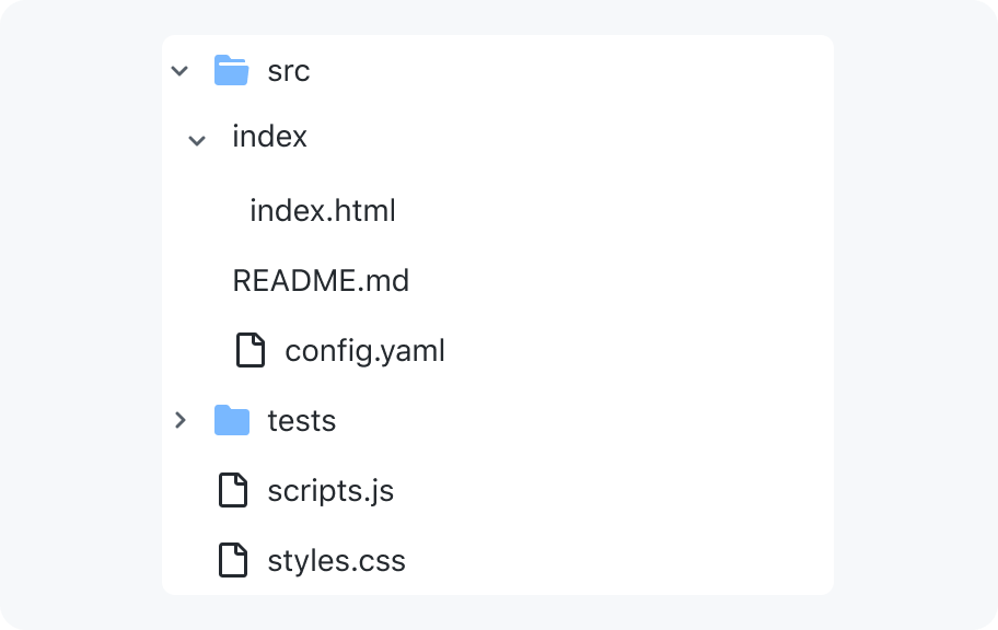
Don't have a tree where only some nodes have leading visuals
Interaction
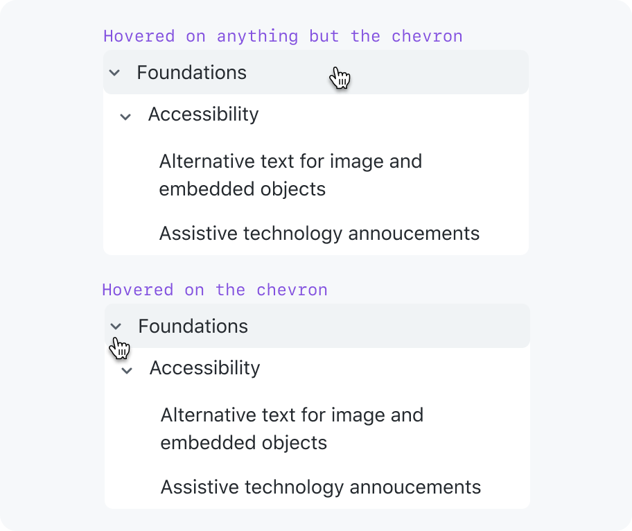
Keyboard users can expand or collapse nodes without activating them by using the left and right arrow keys. To give cursor users an equivalent experience, there are two click areas:
- clicking the chevron only expands or collapses the node
- clicking anywhere else will activate the node
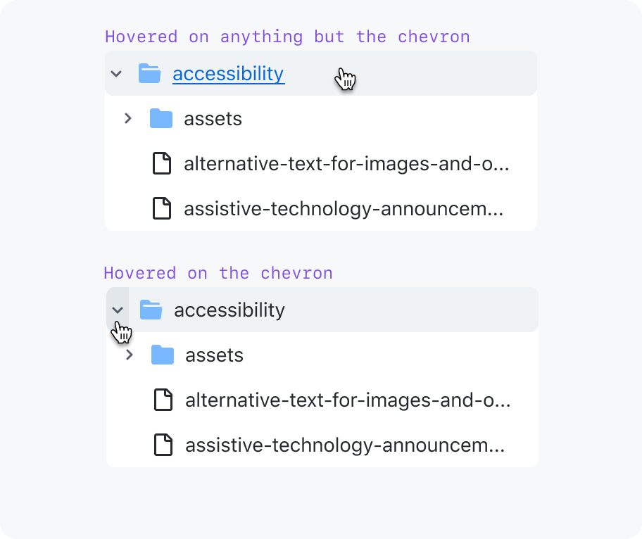
Two click areas - toggle expanded or activate link
One click area - toggle expanded
States
Asynchronously loading child nodes
Show placeholder nodes (preferred)
Accessibility
Keyboard navigation
| Key(s) | Description |
|---|---|
| Enter | Performs the default action (e.g. onclick event) for the focused node which is to activate the link. |
| Tab | Moves focus outside of the tree view to the next focusable node. |
| ArrowDown | Moves focus to the next node that is focusable without opening or closing a node. |
| ArrowUp | Moves focus to the previous node that is focusable without opening or closing a node. |
| ArrowRight | When focus is on a closed node, opens the node; focus does not move. When focus is on an open node, moves focus to the first child node. |
| ArrowLeft | When focus is on an open node, closes the node. When focus is on a child node, moves focus to its parent node. |
| Home | Moves focus to first node without opening or closing a node. |
| End | Moves focus to the last node that can be focused without expanding any nodes that are closed. |
Usage
Tree views are only for hierarchical lists
A tree view solves a very specific problem. It's not a multi-purpose tool like an action list or meant for site navigation like a nav list. Tree views are used to communicate a hierarchical list of items, and allow a user to navigate through, select, and take action on one or more items.
- Navigating the file structure of a repo
- Navigating a codebase's symbols organized by scope hierarchy
- Global sidebar navigation
- An FAQ that collapses answers under question headings