Button
Button is used to initiate actions on a page or form.
Usage
Buttons allow users to initiate an action or command when clicked or tapped. The button's label or text description indicates the purpose of the action to the user. At GitHub, buttons are a fundamental building block of our products. Most of the time, we use the secondary variant, but other variants of buttons may be used to indicate something special about the button's hierarchy or functionality.
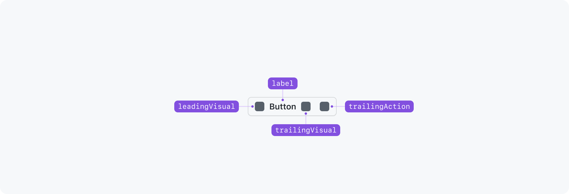
Anatomy
Interactive Examples
Button Variants
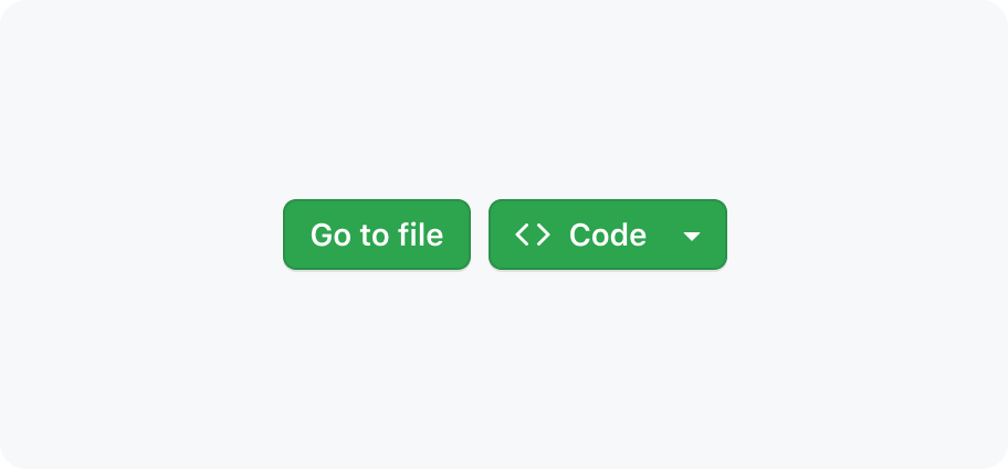
Button Sizes
Buttons with Icons
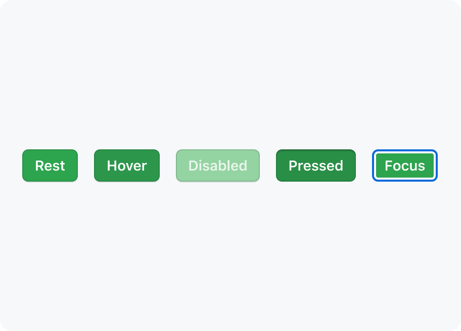
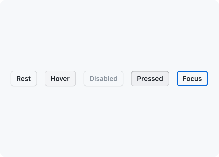
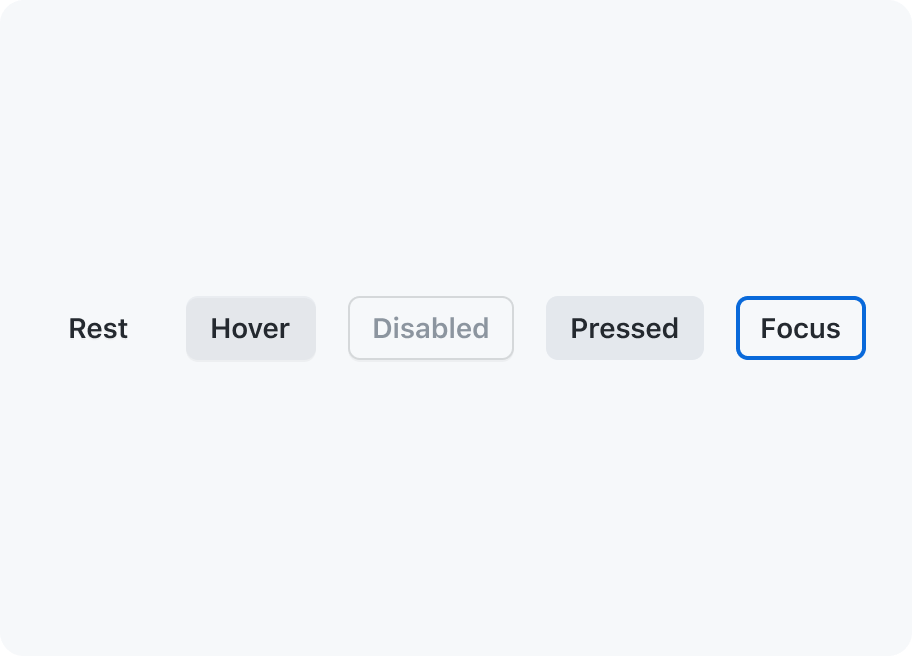
Button States
Options
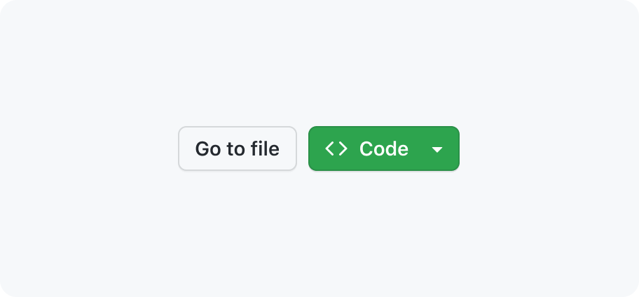
Leading and trailing visuals
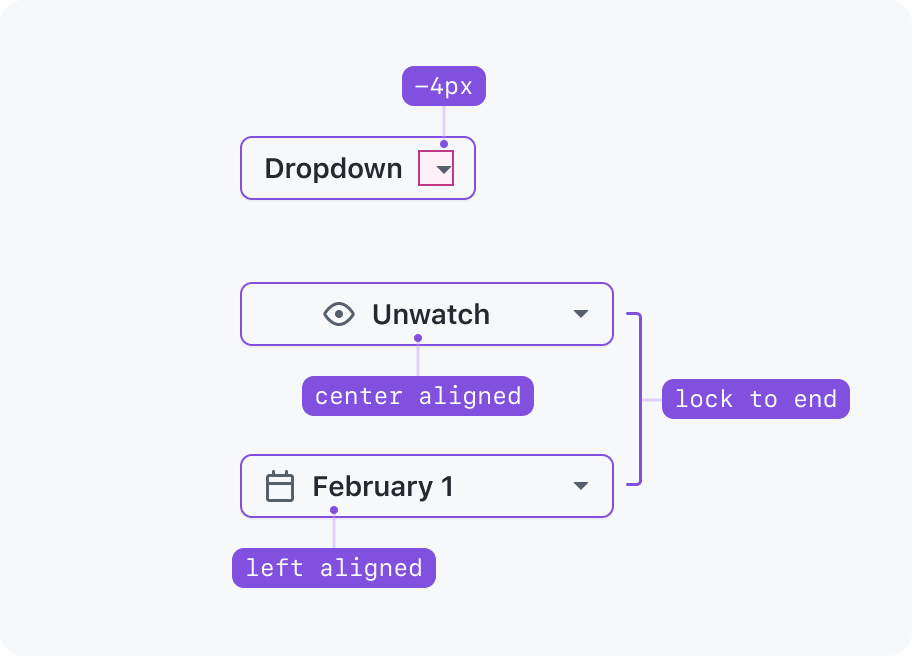
Trailing actions
Trailing actions such as dropdown carets are always locked to the end of a button, which is particularly obvious for full width scenarios. If a button is a call-to-action (Submit, Save, Do this™, etc), its contents (visuals and button label) appear center-aligned inside the button container. If a button is used for selecting items (Weeks ▾, Iteration ▾, Sort ▾, Select™ ▾, etc), its contents (visuals and button label) appear left-aligned inside the button container.
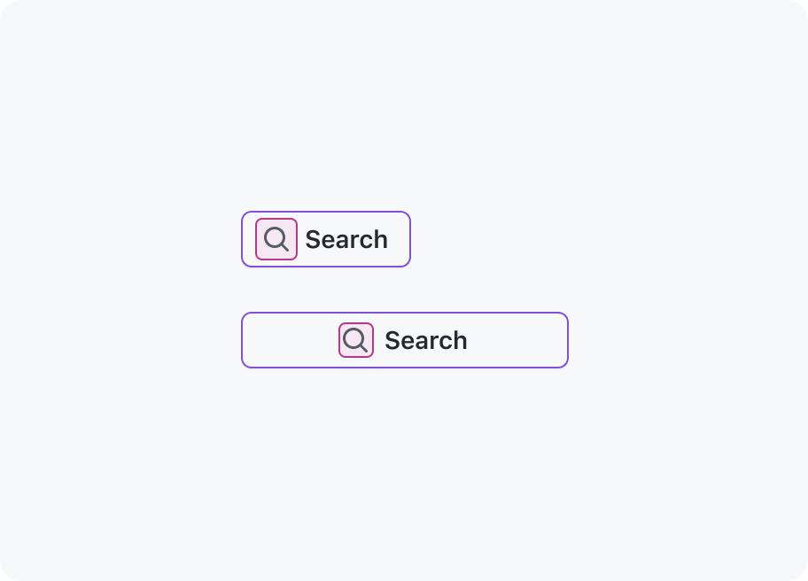
Leading visuals
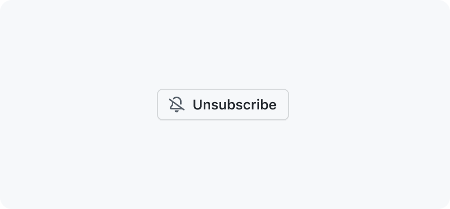
Leading visuals provide additional context for a button label, such as a "search" icon next to the label for a search field submit. Leading visuals always appear locked to the button label, even if the button is full width.
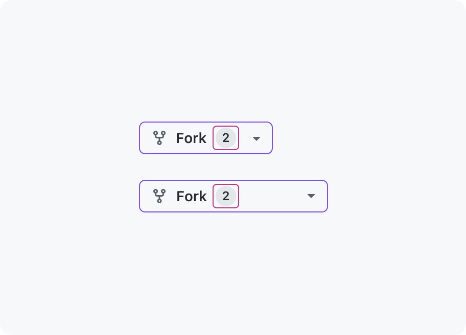
Trailing visuals
Trailing visuals such as counters display additional information about the action or task at hand. Trailing visuals always appear locked to the button label, even if the button is full width.
Sizing and spacing
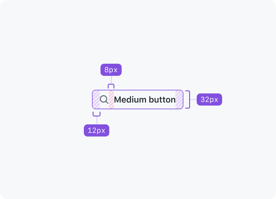
Medium (default)
Primer buttons are medium sized by default. Medium is suitable for most interfaces and is considered the preferred size.
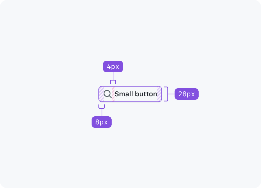
Small
Small buttons may be used when space is limited and if the action is less significant.
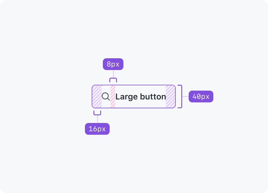
Large
Large buttons increase the significance of an action and should be used sparingly. More often than not a medium sized button will be more appropriate.
Variants
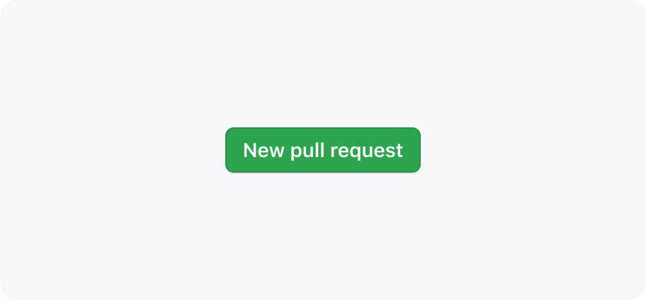
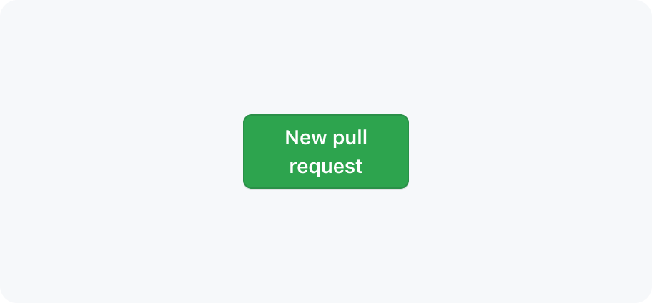
Primary
Primary buttons represent the highest priority action in a page. There should only ever be one primary button (if any) in a button group, and typically only one primary button should be present in page.
Secondary
Secondary buttons are the default button color scheme and are suitable for more interactions. They can be paired with a primary button to perform a secondary action, or used on their own.
Invisible
Invisible buttons have a transparent background with translucent hover and active states, making them useful for compound components like ActionList.
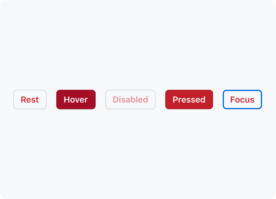
Danger
Danger buttons should be used sparingly to warn of a destructive action, typically resulting in the opening of a confirmation dialog.
Inactive
An inactive button has styles that make the button appear "muted". The style is the same for all button variants.
An inactive button is an accessible alternative to a disabled button. They're intended to be used for buttons that are non-functional, but cannot be removed from the page.
Unlike a disabled button, an inactive button can respond to user input. For example, if a button shows a tooltip when hovered or focused, or a dialog when clicked.
If you need to use an inactive button, it's best to have something else on the page that informs users about the issue that broke the button's normal functionality. For example, showing a global banner for service outages.
Loading
You may use a button loading state if we need to wait for a button's action to be completed. Refer to the accessibility section's button loading state guidance for more information.
Best practices
Primary variant
Only use one primary button on a page, whenever possible, to indicate its emphasis relative to other actions.
General
Keep button labels succinct with no line breaks.
Buttons should never contain line breaks and lose their button shape.
Use sentence case for labels.
Don't use all-caps or other text formats.
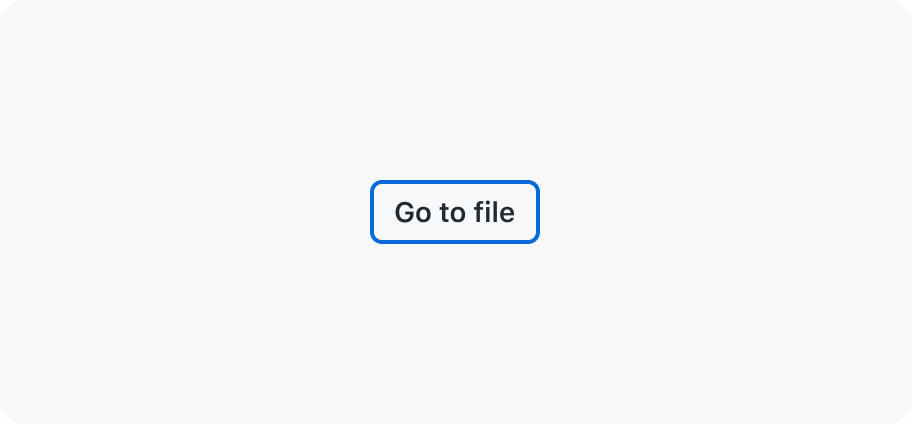
Show focus styles on keyboard :focus
Don't remove default button :focus styles.
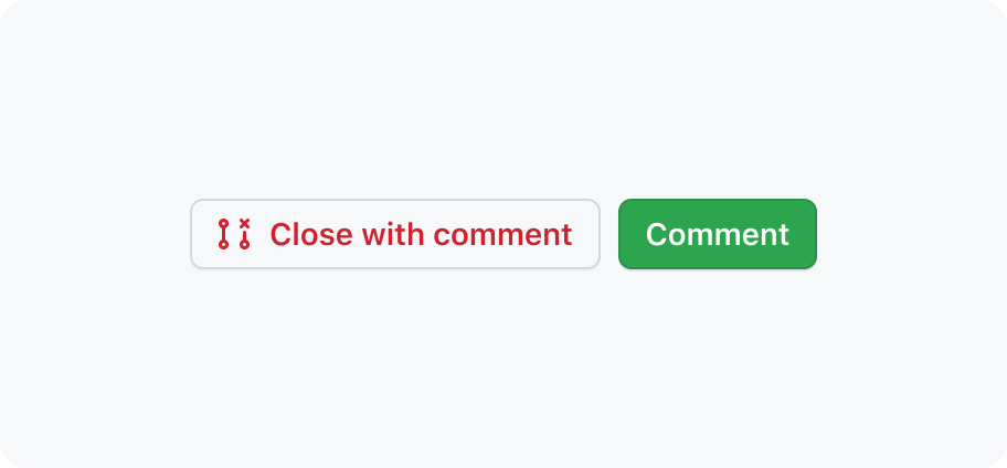
Do place primary buttons at the end of a button group
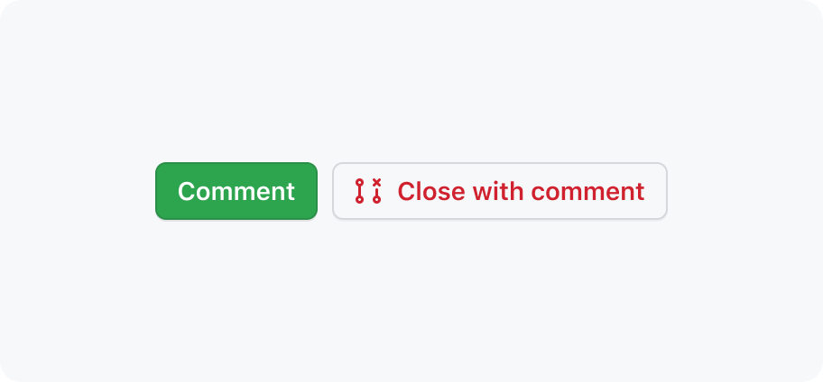
Don't place primary buttons at the start of a button group
Use a primary button with a secondary button
Don't place multiple primary buttons together
Selections
Buttons are commonly used to show a choice within a SelectPanel or ActionMenu. In such instances, they are frequently paired with an internal or external label.
When dealing with multiple selections, it's essential to maintain clarity regarding the total selection at all times. We suggest showing the value directly within the button. However, in scenarios where multiple items are selected, transitioning to a format such as 2 selected is advisable.
Use the '2 selected' format when multiple items are selected
Don't comma separate multiple selections
Accessibility and usability expectations
Buttons must have a clear and descriptive label. The label is the visible content of the button and will usually be text. The label should be concise and descriptive of the action that will be performed when the button is activated. This label will be used as the button's accessible name.
When using Octicons for leading and trailing visuals, note that icons don't have any text alternative. They are purely visual, and not conveyed to screen readers. Don't rely on these icons alone to convey meaning – make sure that the text label of the button provides sufficient meaning/context on its own.
Button has different schemes/variants (such as danger, primary, invisible), which result in different text, background, and border colours. Note that these differences are purely visual - they may be difficult to distinguish for users with impaired color perception, and won't be exposed at all to screen reader users. For this reason, you can't rely on the scheme/variant alone to give meaning to your content. Make sure that the text label of the button provides sufficient meaning/context on its own, regardless of its visual presentation.
The button must have a minimum target size of 24×24 CSS pixels. This is to ensure that the button is large enough to be easily activated by users with motor impairments.
Do not disable buttons
There are rare cases where it's ok to disable a button, but it should generally be avoided. In forms mode, they won't be discovered as they won't take keyboard focus.
Inactive buttons and aria-disabled
An inactive button should not be conveyed as disabled with aria-disabled if it performs an action when activated. For example, showing a dialog with more info about why the button is inactive.
An inactive button may be conveyed as disabled with aria-disabled if it does not perform an action when activated.
Button loading state
When implementing a "loading" button state, don't remove the button from the DOM or pass the disabled attribute. Doing so would make it impossible to tab to the button. If the button was just focused and activated, it would reset focus. Resetting focus would disrupt the keyboard navigation flow, and creates a confusing experience for assistive technologies such as screen readers.
Once the button is activated (and is in a loading state), it should get the attribute aria-disabled="true".
A separate, visually hidden element should be rendered outside of the <button> with a message to communicate the loading status. For example, "Saving profile".
This message should be in an ARIA live region, using aria-live="polite". The live region must be present on page load, but the message inside the live region should only be rendered while the button is in a loading state.
If an error prevents process from being completed, focus should be brought to an <h2> (or next relevant heading) of the error banner.